Working with Teft: Spacing
Table of contents
Intro
Have you ever tried to finish up the styles on a project and had this feeling?

Working with blocks introduces a lot of different scenarios and combinations of content and settings, many more than can be accounted for in the design. This can cause blocks that have been developed and styled to look perfect on their own to look terrible in a content flow or inside a formatting block.
Thankfully this is usally a lot easier to handle by making sure that all parts
of the project follow the rules and logic set in the
@teft/wordpress and @teft/theme
package. So let’s have a look at that.
Also, please note that Teft is constantly growing and changing so some technical details in this article might be outdated. however the general philosophy and approach should, hopefully, apply for the foreseeable future.
Widths
 While not technically spacing, widths are important to understand in order to
use the Teft framework correctly.
While not technically spacing, widths are important to understand in order to
use the Teft framework correctly.
Teft has 3 widths. This is based on the 3 widths in Gutenberg. If you are thinking about adding an additional width to your project please consider if there is any other solution, this can have cascading issues both i Teft frontend and in the Gutenberg UI.
In some designs it might make sense to have some article-blocks be accented from the rest of the content, an example of how to solve this without adding extra widths can be found at the end of this section.
The three widths we are using are the following
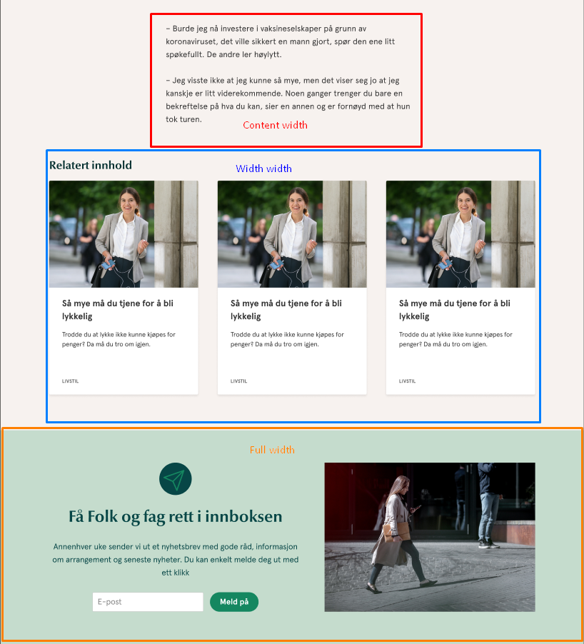
Content width
This is the smallest size and is suitable for text-content. This can be considered the “default” and doesn’t have a specific class.
The content width is controlled by the --teft-theme-content-width variable in
Teft. It should be set to a width that causes normal paragraph text to have
around 20 words per line.
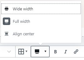
Wide width
This size is larger then the content width but still has a max width. it is
suitable for visual elements such as banners or card grids. The class used for
this width is alignwide and it’s called “Wide width” in Gutenberg.
The wide width is controlled by the --teft-theme-site-width variable in Teft.
Full width
This size covers the entire width of the screen, regardless of screen size.
The class used for this width is alignfull and it’s called “Full width” in
Gutenberg. This is suitible for visual elements such as banners and images that
should break the content into sections, but also for elements that need
background colors, often in the case of a group block.
Content width variations
 A somewhat clean way to have certain elements/blocks exceed the content width is
to target them specificly and give them a max width based on the content width.
A somewhat clean way to have certain elements/blocks exceed the content width is
to target them specificly and give them a max width based on the content width.
The orange example in the screenshot can be handled by a rule like this:
@media (--teft-viewport-large) {
	.entry-content > p + .my-block {
		max-width: calc(var(--teft-theme-content-width) + 200px);
	}
}
Margins/Paddings
There are some spacing variables in Teft, sometimes more is needed, that’s not an issue. But the important thing to understand is that everything should be general. If something doesn’t look right, make sure that it is following the design-system. If it still looks wrong, try to understand how the designsystem can be extended to allow for the design, or discuss if maybe the design should be changed to follow the rules set for the framework.
If you are adding margins/paddings to the outsides of a specific block you are probably doing something wrong, and this quickly has consequences when blocks are stacked differently or put inside of layout blocks such as the group or columns-block.
Here are the different spacing-variables and what they are used for:
--teft-spacing-block-margin
This represents the vertical margin between blocks, or the vertical padding inside of blocks with a background color.
--teft-theme-negative-block-margin
This is a negative margin added to the top of any block that should have a text-flow look. It’s automatically added to things like paragraph blocks and such to effectively reduce the block margin and make it more connected. This needs to be smaller than the inversed block-margin. (i.e if block margin is 5rem negative block marin needs to be larger than -5rem)
--teft-theme-site-padding
This is the side site padding that’s added around the page content so that there
is some space between blocks and the side of the screen. The inverse is also
used on full width (alignwide) blocks to make sure that they do extend to the
edge of the screen.
--teft-cards-gap
This is the space between cards in the card grid, and most likely any other flex-grid blocks in Teft. Will break if the variable size times the number of columns (usually 12) won’t fit on the screen, so if this is overridden make sure that the value is very small on mobile.
Common issues with spacing
“Sometimes the spacing between blocks is to large”
This is usually due to a block using padding instead of margin even though it
doesn’t have a background color. Make sure that a block ONLY has vertical
padding if it has a background color. If everything is setup correctly blocks
with background color should have the class has-background
“No really, my block needs padding. it looks like X”
Why does it look like that? is there any pattern? if not, the designer might need to have another look at the block. If you find the pattern try and write something general. usually it’s because of a background color, a border or something similar. in that case something like
.entry-content > *(.has-background):not(has-white-background) {
	margin: 0 auto;
	padding: var(--teft-spacing-block-margin) 0;
}
will solve that and every other case on your site.
“There shouldn’t be white space between these blocks”
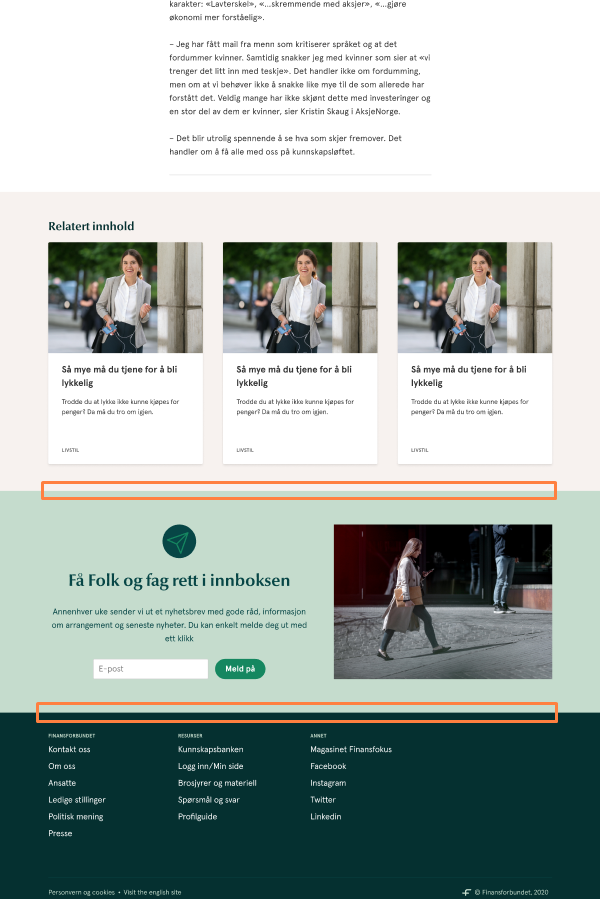 Sometimes there shouldn’t be any block spacing at all, this is usually when two
full-width blocks width a background color or background image is put after each
other, or right before the footer.
Sometimes there shouldn’t be any block spacing at all, this is usually when two
full-width blocks width a background color or background image is put after each
other, or right before the footer.
This is solved by removing the vertical margin block spacing from blocks that
are both alignfull and has a background color or background image. (usually
has-background)
“I want less spacing on this specific block”
Sometimes a specific block spacing is handled differently in different places in the design. And sometimes the client asks for a specific block to have more or less spacing. While this is absolutely possible to do with css, it is also very likely to break down the line. Instead consider if maybe the block should be part of the text flow rules (with negative space margin if after a paragraph or heading block). Or if it could be placed inside of a layout block in that specific case.
How is spacing applied in teft
Let’s get into the code. This could help you understand why things work as they do, and when you might need to extend the style to suit the project needs.
The block spacing and width rules are automatically put on every element directly inside the “entry-content” class. This is the default wordpress content wrapper. The rules look like this:
.entry-content > *,
.wp-block-cover__inner-container > *,
.wp-block-group__inner-container > *,
.wp-block-quote.is-style-large, .wp-block-teft-cards-theme > * {
	margin: var(--teft-spacing-block-margin) auto;
	max-width: var(--teft-theme-content-width);
}
<-- applies the general spacing and width -->

.entry-content > .alignwide,
.wp-block-group__inner-container > .alignwide,
.wp-block-teft-cards-theme > .alignwide {
	max-width: var(--teft-theme-site-width);
}
<-- applies the increased width to alignwide -->

.entry-content > .alignfull {
	margin-left: calc(var(--teft-theme-site-padding)*-1);
	margin-right: calc(var(--teft-theme-site-padding)*-1);
	max-width: none;
	width: calc(100% + var(--teft-theme-site-padding)*2);
}
<-- applies the full width to alignfull -->

.entry-content > .wp-block-quote + ol,
.entry-content > .wp-block-quote + p,
.entry-content > .wp-block-quote + ul,
.entry-content > h2 + *,
.entry-content > h3 + *,
.entry-content > h4 + *,
.entry-content > h5 + *,
.entry-content > h6 + *,
.entry-content > ol + p,
.entry-content > p + .wp-block-quote,
.entry-content > p + ol,
.entry-content > p + p,
.entry-content > p + ul:not(.wp-block-gallery),
.entry-content > ul:not(.wp-block-gallery) + p,
.wp-block-group__inner-container > .wp-block-quote + ol,
.wp-block-group__inner-container > .wp-block-quote + p,
.wp-block-group__inner-container > .wp-block-quote + ul,
.wp-block-group__inner-container > h2 + *,
.wp-block-group__inner-container > h3 + *,
.wp-block-group__inner-container > h4 + *,
.wp-block-group__inner-container > h5 + *,
.wp-block-group__inner-container > h6 + *,
.wp-block-group__inner-container > ol + p,
.wp-block-group__inner-container > p + .wp-block-quote,
.wp-block-group__inner-container > p + ol,
.wp-block-group__inner-container > p + p,
.wp-block-group__inner-container > p + ul:not(.wp-block-gallery),
.wp-block-group__inner-container > ul:not(.wp-block-gallery) + p,
.wp-block-teft-cards-theme > .wp-block-quote + ol,
.wp-block-teft-cards-theme > .wp-block-quote + p,
.wp-block-teft-cards-theme > .wp-block-quote + ul,
.wp-block-teft-cards-theme > h2 + *,
.wp-block-teft-cards-theme > h3 + *,
.wp-block-teft-cards-theme > h4 + *,
.wp-block-teft-cards-theme > h5 + *,
.wp-block-teft-cards-theme > h6 + *,
.wp-block-teft-cards-theme > ol + p,
.wp-block-teft-cards-theme > p + .wp-block-quote,
.wp-block-teft-cards-theme > p + ol,
.wp-block-teft-cards-theme > p + p,
.wp-block-teft-cards-theme > p + ul:not(.wp-block-gallery),
.wp-block-teft-cards-theme > ul:not(.wp-block-gallery) + p {
	margin-top: var(--teft-spacing-negative-block-margin);
}
<-- decreses spacing for blocks considered text-flow -->

.entry-content,
.wp-block-cover .wp-block-cover__inner-container {
	margin: 0 auto;
	width: calc(100% - var(--teft-theme-site-padding)*2);
}
<-- applies the site gutters -->
This means that if your project, for some reason, doesn’t have the entry-content class around the content. The teft spacing and width systems will not be applied. It also means that it is not applied to blocks inside of other blocks, such as blocks in a group-block or column-block.
While this is somewhat intended, for example alignfull negative site padding applying twice would result in the block going outside of the page, it also means that you might need to add some of the rules back to blocks where inner blocks are commonly used and meant to flow like the normal block flow. Most commonly this is the group block.
This could be done by adding something like this:
.entry-content > .my-group-block .inner-blocks > * {
	margin: var(--teft-spacing-block-margin) auto;
	max-width: var(--teft-theme-content-width);
}
<!-- also alignwide and alignfull might need handeling -->
Wrapping up
So some rules of thumb when styling/developing teft projects
- Use the three provided sizes, don’t add more
- Don’t add margins or padding to the outside of specific blocks, this should be handled generally
- Populate and use the spacing variables. Does your block contain multiple blocks side by side and need internal spacing, use the block-margin och card-spacing variable. Does your element need some space between it and the edge of the screen? There’s a variable for that.
- Post content need to be wrapped by
.entry-content. If block flow is used somewhere else like inside of another block, spacing needs to be handled separately (or just add the class if it should be handled identically)
If you are struggling with the teft framework please don’t hesitate to reach out either directly to one of the front end developers (this article was written by Alex) or to the #teft slack channel.